

The Mystery of Cover Art Design - Part 2: The Mockup Process
Here’s the follow-up to last week’s Mystery of Cover Art Design. In Part 2, you’ll get to inspect the mockups, see how my original recommendations to the cover artist proved unworkable, and watch the final design evolve. Man oh man, did I learn lessons along the way!
The cover mockup from the artist. That’s where we left off. I had just received an email with a file attached. And in the email, the artist asks for feedback. She wants to know my thoughts before submitting the “mock” to the art department for approval.
My first mock. This is so surreal! Reminds me of when I was in the delivery room with my late wife for our firstborn and the doctor says: “Would you like to meet your new son?”
“Let me get my camera,” I told the doc and then snap a picture. The flash sizzles. This is old school, color film, way before digital, iPhones, and instant photos. My son is...perfect in every way as most newborns are. Fully developed. All ten fingers and toes.
Will my mock be fully baked? Or will the cover need to spend time in the incubator?
I shake with excitement as I click on the .jpeg the artist provided.
The attachment renders on the screen:
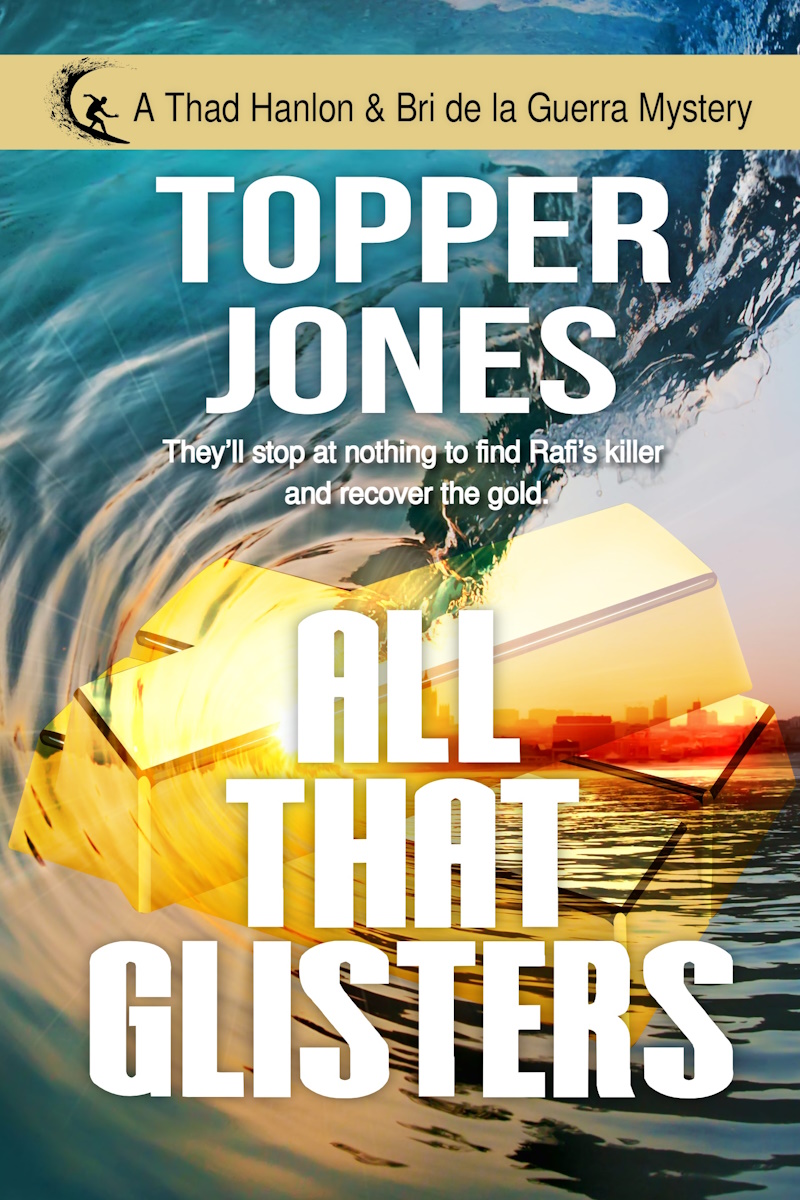
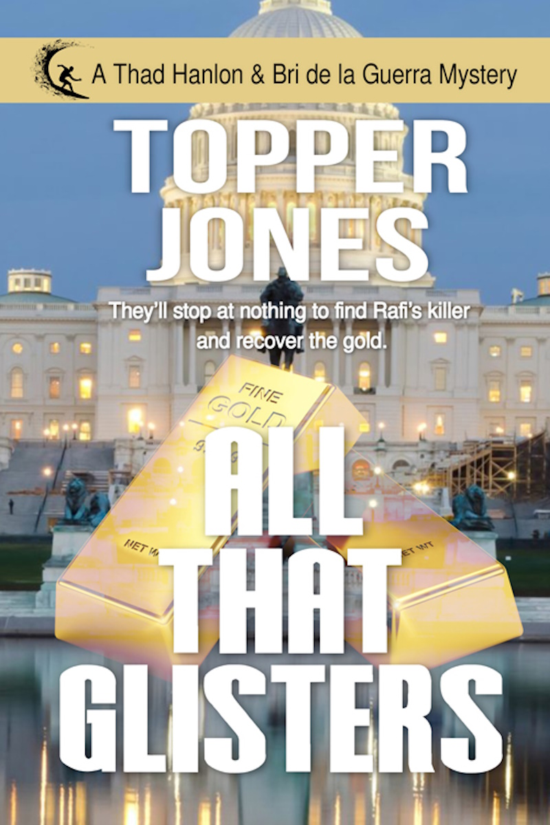
Oh, oh, oh! Series banner. Check.
Tagline. Check.
Thematic elements. Check.
And the cover fonts match the bold lettering “look” of similar genre titles from the suggested web links I sent.
But the art itself isn’t quite what I had in mind.
Some of the concepts yes, but the layering, the mashup, requires a further inspection. I enlarge the cover design, one image at a time. The breaking wave...
The gold bullion...
The city skyline...
I share the mock with my wife, a fellow writer with five books under her belt and a good eye for artwork. We discuss. I mull. And then I respond to the artist:
“You asked for my thoughts. First off, I love the color scheme, the blues and gold, with a hint of fire in the city skyline. Here’s what I suggest for the next iteration:
- Consider using Washington DC for the skyline to build political intrigue. Although the Treasury Building plays a prominent role in the action (I know, I know...I’m the one who suggested the Treasury Building) but I doubt most readers would recognize the silhouette even though it’s featured on the back of every U.S. $10-dollar bill. Something like the Washington Monument, U.S. Capitol, etc. would probably work better.
- Enhance the detail on the face of the gold so that it’s clear the bars are bullion and not buildings in disarray from an explosion. Suggest adding minimal stamping: Fine Gold 999.9. Much of the storyline revolves around gold purity so it might be good to pique the reader’s interest with the cover art in this way.
The next day, I receive two new cover designs from the artist with a note:
“Okay, I've attached two new mocks. I’m using a different image now for the gold to make it more pronounced that it’s bullion. Oh, and the reason I used the wave in that first mockup was to bring in your character as a surfer and the gold for the storyline.
“I also tried different colors for the title, but white stood out the best, more popping for readers.
“Both mocks have different backgrounds so look them over and let me know which one you prefer. The images are numbered, so just give me 1 or 2.”
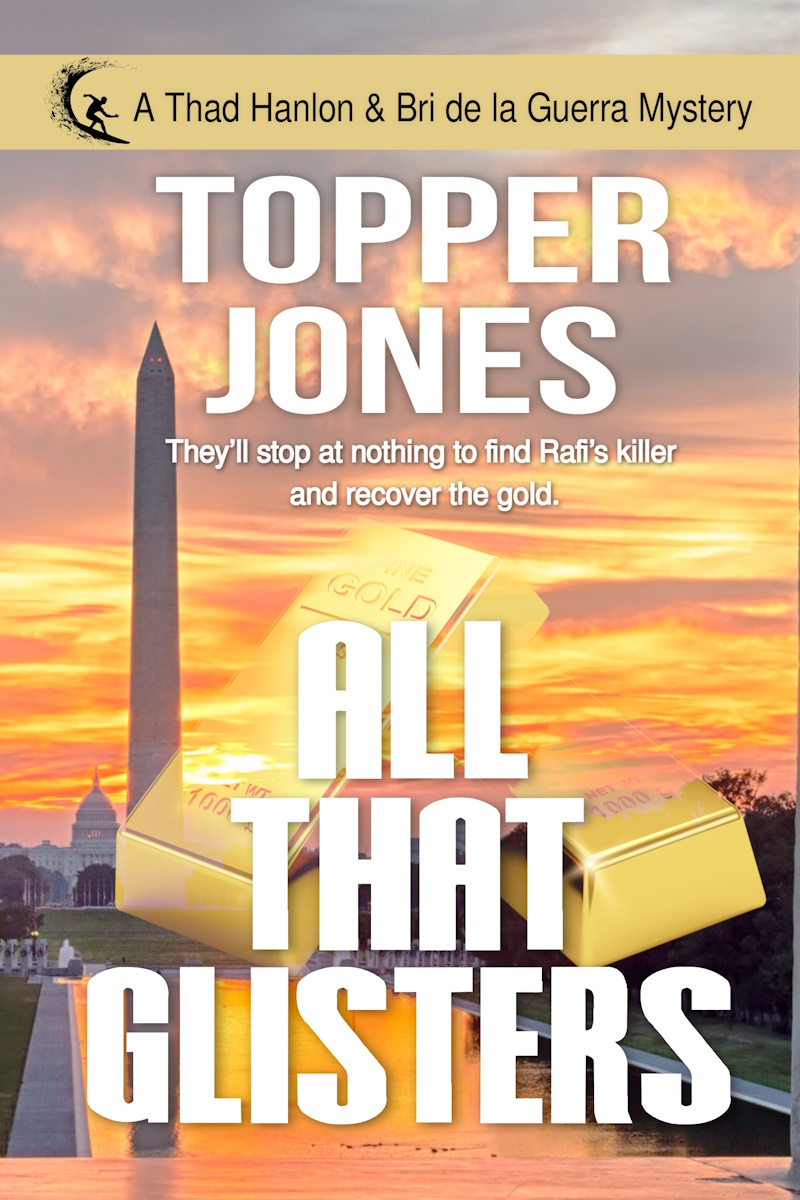
I run the designs by my wife in a side-by-side cover test. Get her feedback. We both agree 1 and 2 are better than Mock 0. I email the artist back with my preference:
“Let’s go with Mock 2. The bullion stamping is clear, and the color schemes (blue/gold) are eye-grabbing. The reader will get the surfing connection to the main character through the logo in the series banner. No need for an ocean wave in the cover art.
“One technical issue: The stamping shows 1000 g or 1 kilo. The average U.S. Mint gold bullion bar is 13 kilos. Would it be possible to Photoshop out the 1000 g marking or is this me being too much of an accountant?”
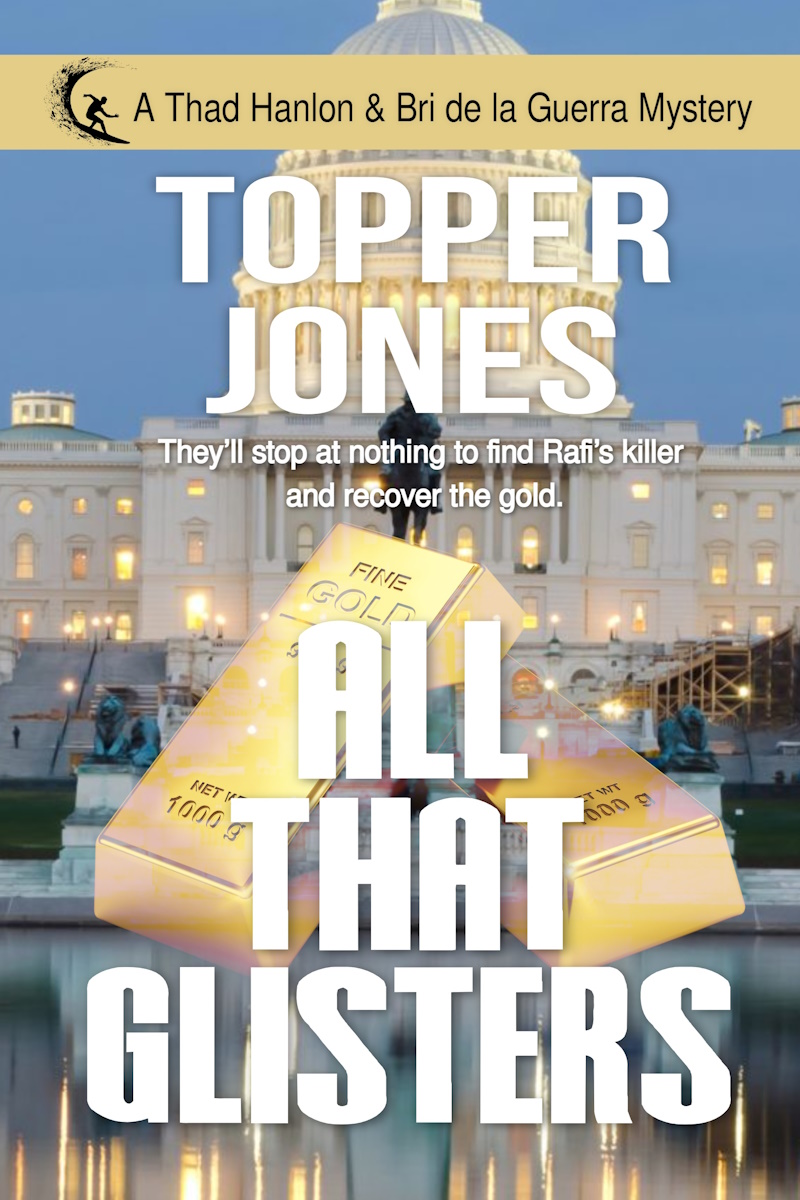
More back-and-forth emails with the artist over tweaking the bullion stamping details. She sends an update and a note:
“So, should I submit it to the cover department for approval?”
I send back a thumbs up.
So now for the final cover reveal with all the changes:
Join Me
Thanks for reading my blog. You can get more ideas for navigating today’s fast-paced publishing world in my popular email newsletter. Each week, I share insights into the writing craft, tips for further exploration, and the latest news on Hanlon & de la Guerra mystery series. Click the link below now and join us.