

Cover Reveal - PISMO BEACH SNIPER
So excited to reveal the cover for PISMO BEACH SNIPER.
High Octane. Tense. You can feel what’s coming.
A million thanks to Lea Schizas, my cover artist (and multitalented editor) at The Wild Rose Press, for bringing the intrigue to life.
From Book Title to Cover Design
Working off the “sniper” theme suggested by the book’s title, I created three simple mockups of “surfers under threat” in Canva, a graphics design tool. The first involved a couple of surfers, boards tucked under their arms, headed out to the waves. From a sniper’s perspective, easy targets.
The second mockup involved a surfer sitting on a board out in the lineup, waiting to catch a wave. A sitting duck from a sniper’s point of view.
The third and final mockup included a surfer emerging from a barrel wave, locked in the tube, the crest cascading over him, requiring a steady rifle barrel, as the sniper centers his sights.
Concept Testing with My Writers Improvement Group
One of the nice things about belonging to a weekly writing critique circle is that you have a built-in focus group. I took the three mockups to the workshop and asked the members to rank them.
The voting was unanimous. When it comes to a sniper target, as suggested by the book’s title, they liked the surfer emerging from the barrel wave the best.
Barrel wave. Rifle barrel. Lyrical and visual irony. Plus focus group unanimity.
I couldn’t argue with that, so I drafted the following for the artist in response to her prompt:
What is your general vision or concept for the cover?
PISMO BEACH SNIPER is the third volume in the Thad Hanlon & Bri de la Guerra Mystery Series. This tale opens with a crazed marksman taking potshots at Pismo Beach surfers during the California Central Coast Surf Trials. Surf culture and the beach scene play an important part in the fabric of the series’ imagery.
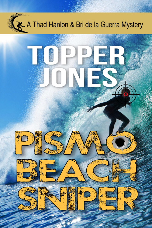
My vision for the cover is a brooding scene of a surfer emerging from deep inside a barrel wave. The lighting is moody and high-contrast, with deep shadows and a cold, glassy texture to the water, and spray frozen in sharp detail. The surfer is a teenager, but not resembling any real person, wearing a dark wetsuit with a blue surf competition jersey, face tense and focused, body leaning forward on the surfboard as the wave begins to close around him. A sniper rifle crosshair reticle is centered directly on the surfer’s head.
At the top of the cover is the mystery series banner (Surfer icon followed by “A Thad Hanlon & Bri de la Guerra Mystery). Just below that is the author's pen name using a similar style font as was used for ALL THAT GLISTERS and OCEANO BEACH BEDLAM. At the bottom of the cover is the book title. I’d suggest a grunge or distressed font. If the lettering allows it, a bullet hole through the “O” in Pismo would help emphasize the danger presented by the sniper’s crosshairs.
And Here’s the Final Cover
For a peek at the blurb, click here: https://topperjones.com/product/pismo-beach-sniper
Join Me
Thanks for reading my blog. You can get more ideas for navigating today’s fast-paced publishing world in my popular email newsletter. Each issue, I share insights into the writing craft, tips for further exploration, and the latest news on the Thad Hanlon & Bri de la Guerra mystery series. Click the link below now and join us.