

Galley Proof Nightmares - Part 2: Micro-level Foul-ups
In last week’s blog post, we discovered the world of Macro-level Bloopers—the kind of troubling errors you spot during your galley review, pouring over that final-final-final manuscript all typeset in page-proof format. Things like plot inconsistencies, flaws in character descriptions, and anything major that you missed in the first- and second-round edits.
In Part 2 of Galley Proof Nightmares, we pick up with Micro-level Foul-ups starting with Full-justification Mangles.
It’s time to get down to the real nitty-gritty.
Micro-level Formatting Foul-ups — A Sample
Full-justification Mangles
For most print books, justified or full-justification alignment is preferred. This means the text is flush up against both the left and right margins. Justification gives the text a formal look and has been popular since the advent of movable type. But sometimes, justification leads to typographic anomalies with large spaces between words.
Witness the following mangled lines from my Galley Proof.
Full Justification White Space Mangling Example 1
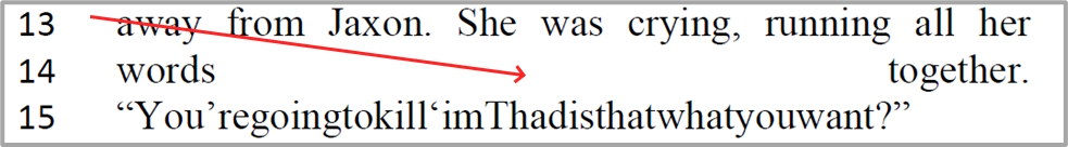
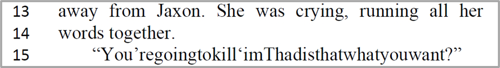
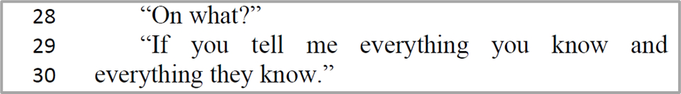
The Problem: In Line 15 of the action paragraph above, one of the sleuths is trying to convince her partner to stop pummeling the bad guy. She blurts out a plea running all 11 words together into a single 44-character word composite.
The Solution: Make the plea a separate paragraph of its own, forcing the justification algorithm to treat the action description as a whole, without introducing unnecessary whitespace between “words” and “together” on Line 14.
The Corrected Galley:
Full Justification White Space Mangling Example 2
The Problem: Verbal pauses are often indicated by ellipses. Unfortunately, typesetting assumes a phrase with embedded ellipses is a single word making a mess of the justification, with extra white space everywhere.
The Solution: Eliminate the ellipses.
The Corrected Galley:
Full Justification White Space Mangling Example 3
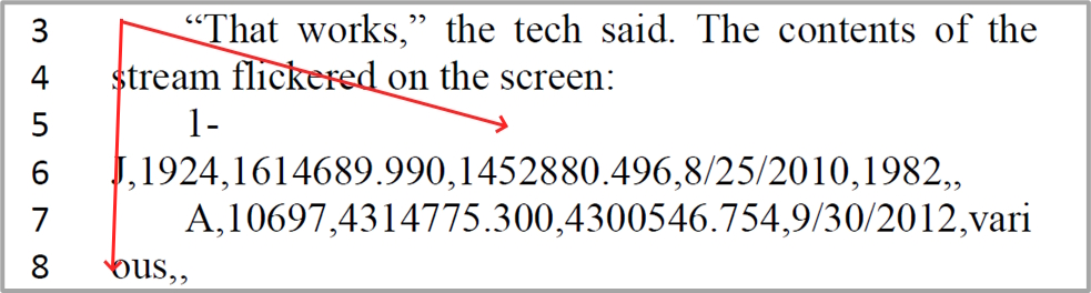
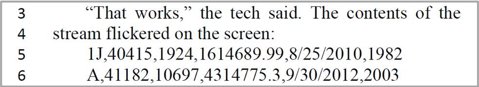
The Problem: Justification algorithms are notorious for having trouble with hyphens, often introducing line breaks in odd places. In addition, long streams of alphanumeric characters can confuse the justification attempt, resulting in line breaks that don’t treat the underlying data with integrity (e.g., lines 7 and 8 above).
The Solution: Eliminate the hyphen in the data set. Shorten the data set to key data fields so that they don’t wrap to the next line.
The Corrected Galley:
Tormenting Typos
The thing about fiction is that it’s all made up. The people, the places, the parties involved in the plot. As mentioned in the previous blog post, it’s easy to forget the exact hair color of one of your characters because you’re not relying on memory of what actually takes place. It’s make-believe and as with any lie, it’s easy to get tangled in an ugly web of inconsistencies “when first we practice to deceive.” (Thank you, Sir Walter Scott.)
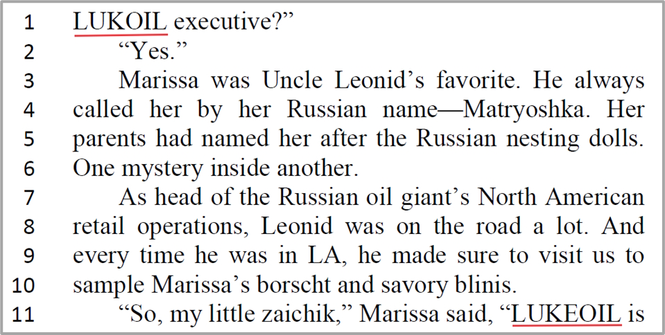
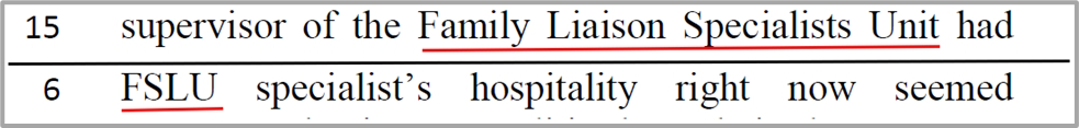
The tangle extends to the spelling of fictitious company names and acronyms. Here are a few I spotted in the Galley Proof.
Spelling Inconsistency on the SAME Page
Spelling Inconsistency with Acronym
Old-fashioned Punctuation in a World of Curly Quotes
This particular formatting flub is insidiously hard to detect. For some odd reason, whether through text import or issues with Microsoft’s Smart Quote technology, stray unformatted punctuation can pop up in your manuscript. Let’s start with the old-fashioned quote mark versus today’s curly quotes.
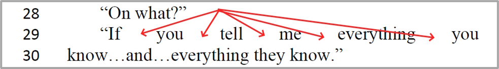
Inconsistent Punctuation Example 1
In this example, the open quote mark before the word “relax” doesn’t match the close quote formatting. Deep in the bowels of the machine, the open quote mark is actually stored as a number using an underlying text encoding scheme. When you load the file, the computer translates that number into a symbol on the screen.
For most word processors, the encoding standard is something called Unicode. In the Line 29 example above, the " is an old-fashioned quote mark from days gone by when the same symbol was used to denote both open and close quotes. Today, most text is formatted using curly quotes. Unicode represents them as separate symbols—left double quote and right double quote.
The fix is simple. Find the old-fashioned quote mark (using the Find and Replace option in your word processor) and replace it with the new.
Inconsistent Punctuation Example 2
This is another example of days-gone-by formatting creeping in. In this case, the word “don't” is punctuated with an apostrophe, which in Unicode would be U+0027. What is required is the right single quote, a completely different Unicode character that looks like a curly apostrophe. Again, a simple fix. Find the straight apostrophe and replace it with the curly version.
Final Galley Approval
With Galley #1—my first galley proof—there were a total of three full pages of corrections. I honestly believed that would be the end of the tidy-up. But in Galley #2, I spotted the punctuation anomalies highlighted in this blog post...and there were a couple of pages of corrections for those. And I caught a few more 30,000-foot viewpoint inconsistencies.
Galley #3 was sparkling clean except for one stray correction that got overlooked, necessitating Galley #4.
Remember the stakes I pointed out in Galley Proof Nightmares-Part 1? Once I approve the Final Galley, it’s done-done—NO MATTER THE ERROR.
So, it was with great trepidation (translation: shaky fingers on the keyboard) that I logged into the publisher’s author portal. I navigated over to my Task List and spied the option for moving the manuscript to the next step in the workflow:
Final Galley Approval Request for All that Glisters
The book title was highlighted in a different color indicating it was a hotlink—something I needed to click to take action.
Time to commit.
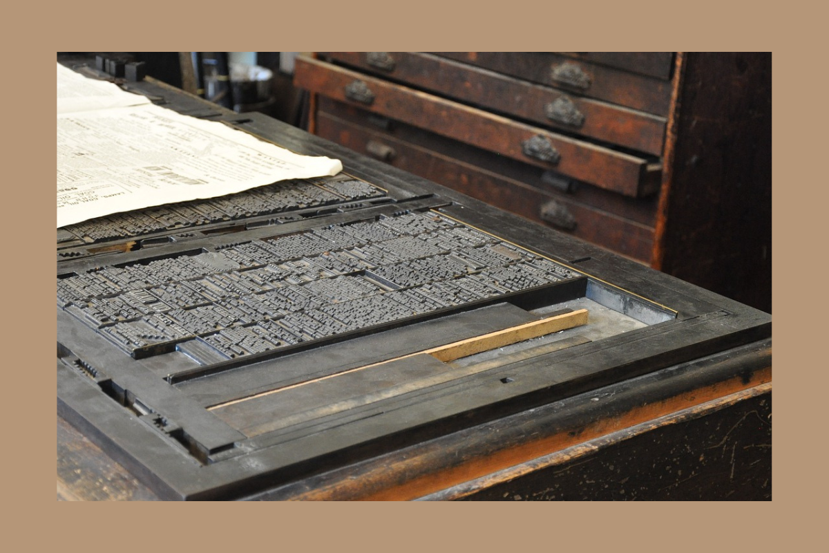
I hovered the mouse pointer over the title and watched it change from turquoise to red, careful not to click just yet. I swear I could almost hear the wheels of production gin up like something from a steampunk gears a’ grinding 3D animation video. Reminded me of the clackety-clack of the local newspaper plant I had visited as a paperboy in my teens—the first time I ever saw the magic of the press. There was a tickle in my nose as I recalled the smell of printer’s ink.
My debut novel was finally becoming something tangible. Something I could hold in my hands. Not just a word processing file of electromagnetic data bits but pages bound with a cover, a cover with my name on it.
I pressed the left mouse button.
A Final Galley Approval Request form popped up asking me to “check the box and click SUBMIT.”
I did.
Galley Approved!
Next Steps
What’s the next step in the manuscript workflow? Notification of the Book Release Date and Receipt of ARCs.
In an upcoming blog, I’ll explain what an ARC is and give an overview of the avalanche of activity surrounding ARC receipt. Stay tuned!
Join Me
Thanks for reading my blog. You can get more ideas for navigating today’s fast-paced publishing world in my popular email newsletter. Each week, I share insights into the writing craft, tips for further exploration, and the latest news on Hanlon & de la Guerra mystery series. Click the link below now and join us.